WebFOCUS Online Help > InfoAssist > Creating and Customizing Chart Queries > Selecting a Chart Type
In this section: |
A chart often conveys meaning more clearly and effectively than data displayed in tabular form. A chart enables you to visually communicate quantitative information. On a chart, you can give data a shape and form, and reveal patterns and relationships among many data values.
It is important that you select a chart type that is appropriate for your data. InfoAssist provides a complete chart type library, which includes advanced chart types, as well as basic types. You can select from a wide variety of chart types to best represent the data that you want to display.
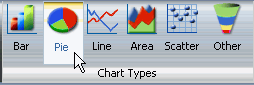
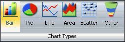
The Chart Types group, which is accessible from the Format tab on the Control Panel, makes chart type selection easy. It provides an array of buttons for selecting the five most commonly used chart types, which include Bar (the default), Pie, Line, Area, and Scatter. A button labeled Other gives you access to the chart type library.
The Chart Types group is shown in the following image.
You can create each chart type using one of the following output formats:
The following are the chart types that you can select.
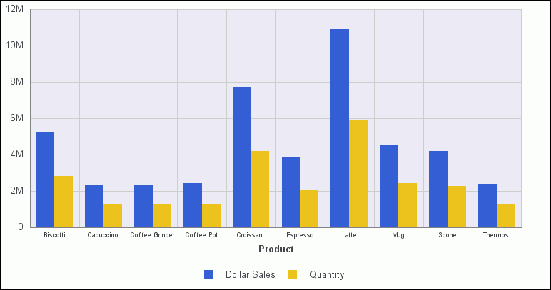
The following is an example of a basic bar chart.
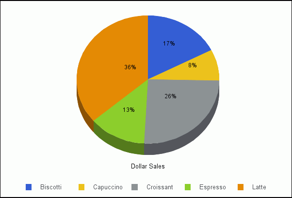
Pie charts. Pie charts emphasize where your data fits, in relation to a larger whole. Pie charts work best when the data consists of several large segments. Too many variables divide the pie into small segments that are difficult to see. Use color on individual segments to create visual contrast. For a complete list of available pie chart types, see Pie Chart Types.
The following is an example of a basic pie chart.
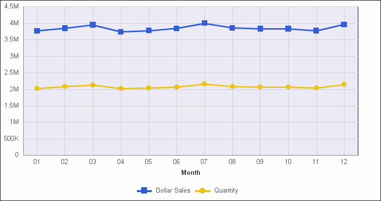
You can also plot line charts with two or more scales to present a comparison of the same value, or set of values, in different time periods. For a complete list of available line chart types, see Line Chart Types.
The following is an example of a basic line chart.
A radar line chart is available in the line chart category, and a radar area chart is available in the area chart category. Radar charts compare two or more data sets. You can use axes or polygons to represent values in a star or spider configuration. Radar charts are essentially analogous to line charts, except that the scale wraps around. Radar charts work well with data that is cyclical, such as the months of a year.
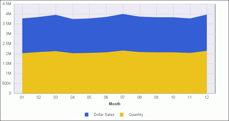
Area charts. Area charts are similar to line charts except that the area between the data line and zero line (or axis) is usually displayed in color. Area charts allow you to stack data on top of each other. Stacking allows you to highlight the relationship between data series, showing how some data series approach a second series. For a complete list of available area chart types, see Area Chart Types.
The following is an example of a basic area chart.
XY plot charts. There are three different types of XY plot charts.
Scatter charts and line charts are distinguishable from one another only by virtue of their X-axis format. Line charts can appear without connecting lines, making them look like scatter charts, and scatter charts can appear with connecting lines, making them look like line charts.
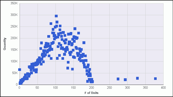
The following is an example of a basic scatter chart.
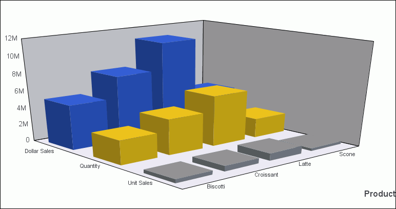
The following is an example of a 3D bar chart.
The Chart Types group provides buttons for selecting the five most commonly used chart types.
The default value is Bar chart.
The following image shows the Chart Types group, with Pie chart selected.
InfoAssist will generate the chart type that you chose.
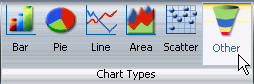
InfoAssist provides a complete chart type library, which includes advanced chart types, as well as basic types. The Other button in the Chart Types group gives you access to the library.
The following image shows the Chart Types group, with Other selected.
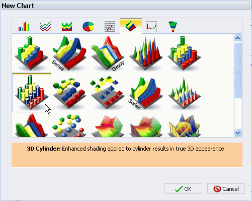
The New Chart dialog box opens. Each of the eight tabs across the top of the dialog box represents a chart type category.
All supported variations of the chart type appear as thumbnail images in the area underneath.
In the following example, the 3D tab is selected (the third tab from the right). Underneath the tab, the 3D chart types supported by InfoAssist are displayed as images. Within the images, the 3D Cylinder chart type is selected, and a description is displayed underneath.
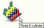
You can also hover over an image with your mouse to display the chart type name.
In the following example, the mouse is hovering over the selected chart type to display its name.
InfoAssist will generate the chart type that you chose.
The following table lists the available bar chart types.
|
Available Bar Chart Types | |
|---|---|
|
Vertical Clustered Bar |
Horizontal Clustered Bar |
|
Vertical Stacked Bar |
Horizontal Stacked Bar |
|
Vertical Dual-Axis Clustered Bar |
Horizontal Dual-Axis Clustered Bar |
|
Vertical Dual-Axis Stacked Bar |
Horizontal Dual-Axis Stacked Bar |
|
Vertical Bi-Polar Clustered Bar |
Horizontal Bi-Polar Clustered Bar |
|
Vertical Bi-Polar Stacked Bar |
Horizontal Bi-Polar Stacked Bar |
|
Vertical Percent Bar |
Horizontal Percent Bar |
|
Vertical Histogram |
Horizontal Histogram |
|
Vertical Waterfall |
Horizontal Waterfall |
|
Multi-3Y Bar |
Multi-5Y Bar |
|
Multi-4Y Bar |
Error Bar |
The following table lists the available pie chart types.
|
Available Pie Chart Types | |
|---|---|
|
Multi Pie |
Multi Ring Pie |
|
Multi Proportional Pie |
Multi Proportional Ring Pie |
|
Single Pie |
Single Ring Pie |
|
Pie-Bar |
Ring Pie-Bar |
The following table lists the available line chart types.
|
Available Line Chart Types | |
|---|---|
|
Vertical Absolute Line |
Horizontal Absolute Line |
|
Vertical Stacked Line |
Horizontal Stacked Line |
|
Vertical Dual-Axis Absolute Line |
Horizontal Dual-Axis Absolute Line |
|
Vertical Dual-Axis Stacked Line |
Horizontal Dual-Axis Stacked Line |
|
Vertical Bi-Polar Absolute Line |
Horizontal Bi-Polar Absolute Line |
|
Vertical Bi-Polar Stacked Line |
Horizontal Bi-Polar Stacked Line |
|
Vertical Percent Line |
Horizontal Percent Line |
|
Radar Line |
|
The following table lists the available area chart types.
|
Available Area Chart Types | |
|---|---|
|
Vertical Absolute Area |
Horizontal Absolute Area |
|
Vertical Stacked Area |
Horizontal Stacked Area |
|
Vertical Bi-Polar Absolute Area |
Horizontal Bi-Polar Absolute Area |
|
Vertical Bi-Polar Stacked Area |
Horizontal Bi-Polar Stacked Area |
|
Vertical Percent Area |
Horizontal Percent Area |
|
Radar Area |
|
The following table lists the available XY plot chart types.
|
Available XY Plot Chart Types | |
|---|---|
|
XY Scatter |
XY Polar |
|
Bubble | |
The following table lists the available 3D chart types.
|
Available 3D Chart Types | |
|---|---|
|
3D Bar |
3D Pyramid |
|
3D Octagon |
3D Cylinder |
|
3D Floating Cubes |
3D Floating Pyramids |
|
3D Connected Series Area |
3D Connected Series Ribbon |
|
3D Connected Group Area |
3D Connected Group Ribbon |
|
3D Cone |
3D Sphere |
|
3D Surface |
3D Surface with Sides |
|
3D Smooth Surface |
3D Smooth Surface with Sides |
|
3D Honeycomb Surface |
|
The following table lists the available stock chart types.
|
Available Stock Chart Types | |
|---|---|
|
Stock Hi-Lo |
Stock Hi-Lo with Volume |
|
Stock Hi-Lo Open-Close |
Stock Hi-Lo Open-Close with Volume |
|
Open-Hi-Lo-Close Candle Stock |
Open-Hi-Lo-Close Candle Stock with Volume |
The following table lists the special chart types that are available to you.
|
Special Chart Types | |
|---|---|
|
Gauge |
Gauge Thermometer |
|
Pareto |
Funnel |
|
Spectral Map | |
| WebFOCUS |