WebFOCUS Online Help > Creating Charts With Graph Tools > Introduction to Creating Charts > Determining Graphing Objectives
In this section: Reference: |
Graphs enable you to display multivariate or complex data efficiently, precisely, and in a way that a viewer can intuitively grasp. A graph is an effective presentation tool because it presents a visual idea, communicating meaningful changes in data to a user in a memorable way. By viewing your graph, a user can identify and track a change that you want them to notice.
Creating a meaningful graph is not simply a matter of applying aesthetics to your data. Instead, graphs enable you to design your presentation to capture the essential information in your data.
Part of determining your graphing objectives consists of identifying chart categories and customizing chart elements to better present your data. The goal is to analyze raw data, transform and combine it in a coherent and meaningful manner. There are several methods of doing so, but most common involve using tables and graphs. Tables and graphs play an important role in business communication mainly because they are two primary means to structure and communicate quantitative information.
Any presentation of data that you prepare is only successful to the degree that it communicates to your target audience what is intended. A common mistake is choosing a particular display medium because it is more entertaining to the reader. For example, some people might be more impressed with a fancy graph rather than multiple rows of text and numbers. What you should keep in mind is that it is all about the data. You have to ask yourself, did the message get through? Was the data understood accurately and efficiently?
What is the difference between Tables and Graphs?
Deciding that one is better than the other (Graphs are better than Tables or vice versa) is not demonstrated, but each is better than the other for a particular communication task. If your message requires the precision of numbers and text labels to identify what they are, you should use a Table. When you want to show relationship of the data, use a Graph. There are no standard rules for when to use which, but there are guidelines we can follow.
Tables work best when the data presentation:
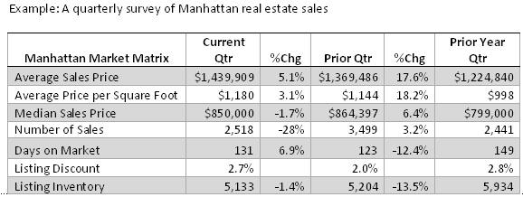
The following image shows a quarterly survey of Manhattan real estate sales in a Table.
Graphs work best when the data presentation:
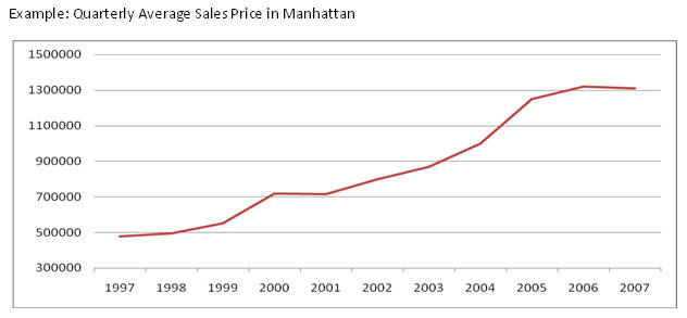
The following image shows the quarterly average sales prices in Manhattan with a line chart.
Keep in mind that Tables and Graphs are not the only means of communication. If you can communicate your message clearly and with the desired impact in a simple sentence, that is what you should do. Let us use an example from the Manhattan real estate market. "The median sales price of a Manhattan apartment was $850,000 this quarter, up 6.4% from the prior year quarter median sales price of $799,000." If your audience is only interested in the change from previous quarter to current, this sentence is sufficient.
For example, depending on your data, certain relationships may suggest that one chart category is better than another. Suppose that you are comparing data from year to year. It may be difficult to compare changes in a pie chart, as shown in the following image. The year is indicated by color without displaying the actual sales amount. Additionally, sales for the year 2000 is barely noticeable in the pie chart.
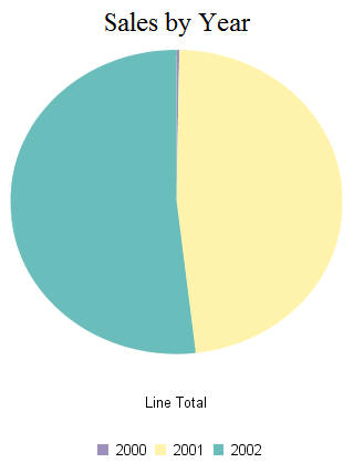
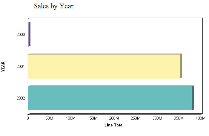
A better option for presenting this data is with a bar chart. Note how you can clearly see the difference in data from year to year in value increments.
The first step in creating excellent graphs is determining your graphing objectives. You can break this process into several stages.
Look for meaningful patterns or changes in the data. Does your data change most dramatically over time or in relationship to some other value? Are there two or more sets of data that you want to compare to each other?
Determine what movement or changes you would like to show. Which of the patterns in the data do you most want to highlight for the viewer?
Select the type of graph that best suits your objectives and the overall shape and flow of your data. Determine what will lead viewers to best comprehend the visual aspects of the data you want to highlight. How can the visual representations of your data be used to communicate your objectives most effectively?
There are several different types of graphs and charts to choose from. The following are descriptions of the types of graphs you can create:
Note: When noted, some graph types are only available in a specific graph tool.
For a complete list of available bar graphs, see Bar Graphs.
For a complete list of available histogram graphs, see Bar Graphs.
For a complete list of available Multi-Y graphs, see Bar Graphs.
For a complete list of available waterfall graphs, see Bar Graphs.
Line graphs can also be plotted with two or more scales to suggest a comparison of the same value, or set of values, in different time periods. The number of scales your graph has depends on the type of graph you select.
For a complete list of available line graphs, see Line Graphs.
For a complete list of available area graphs, see Area Graphs.
For a complete list of available radar graphs, see Area Graphs.
For a complete list of available pie graphs, see Pie Graphs.
It is important to note that scatter graphs and line graphs are distinguishable from one another only by virtue of their X-axis format. Line graphs can appear without connecting lines (making them look like scatter graphs) and scatter graphs can appear with connecting lines (making them look like line graphs).
For a complete list of available scatter graphs, see X Y Plots Graphs.
For a complete list of available polar graphs, see X Y Plots Graphs.
For a complete list of available bubble graphs, see X Y Plots Graphs.
For a complete list of available 3D graphs, see 3D Graphs.
For a complete list of available stock, see Stock Graphs.
Note: The following graphs appear under Miscellaneous graph types in the Graph Assistant.
Note: This graph type only appears in the Advanced Graph Assistant.
Note: This graph type only appears in the Graph Assistant.
The following table lists the available bar chart types:
Available Bar Chart Types |
Description |
---|---|
Vertical Clustered Bar |
Side by side groups of bars. The standard type of two-dimensional bar chart. |
Vertical Stacked Bar |
Stacked groups of bars. Each stack is comprised of all series in this group, added up to get a total. The axis is the total value of the cumulative points. |
Vertical Dual-Axis Clustered Bar |
Also called a Dual-Y chart. Any series can be assigned to either of the two axes. |
Vertical Dual-Axis Stacked Bar |
Also called a Dual-Y stacked chart. Separate stacks are created for the data on each of the two axes. |
Vertical Bi-Polar Clustered Bar |
A Dual-Y chart with the two axes physically split into separate sections, so that each can be seen independently of the other. |
Vertical Bi-Polar Stacked Bar |
A stacked Dual-Y chart with the two axes physically split into separate sections, so that each can be seen independently of the other. |
Vertical Percent Bar |
A bar version of a pie chart. Each group calculates the percent of the total required for each series. The axis goes from 0 to 100%. |
Vertical Histogram |
Standard histogram. Groups all of the data together and assigns it to "buckets" based on value. There are no series or groups in this chart type. |
Vertical Waterfall |
A special type of Floating Column chart showing how an initial value is increased and decreased by a series of intermediate values, leading to a final value. |
Multi-3Y Bar |
Vertical bar chart with three Y-axes split into separate sections. |
Multi-4Y Bar |
Vertical bar chart with four Y-axes split into separate sections. |
Multi-5Y Bar |
Vertical bar chart with five Y-axes split into separate sections. |
Horizontal Clustered Bar |
Side by side groups of bars. The standard type of two-dimensional bar chart. |
Horizontal Stacked Bar |
Stacked groups of bars. Each stack is comprised of all series in this group, added up to get a total. The axis is the total value of the cumulative points. |
Horizontal Dual-Axis Clustered Bar |
Also called a Dual-Y chart. Any series can be assigned to either of the two axes. |
Horizontal Dual-Axis Stacked Bar |
Also called a Dual-Y stacked chart. Separate stacks are created for the data on each of the two axes. |
Horizontal Bi-Polar Clustered Bar |
A Dual-Y chart with the two axes physically split into separate sections, so that each can be seen independently of the other. |
Horizontal Bi-Polar Stacked Bar |
A stacked Dual-Y chart with the two axes physically split into separate sections, so that each can be seen independently of the other. |
Horizontal Percent Bar |
A bar version of a pie chart. Each group calculates the percent of the total required for each series. The axis goes from 0 to 100%. |
Horizontal Histogram |
Groups all of the data together and assigns it to "buckets" based on value. There are no series or groups in this chart type. |
Horizontal Waterfall |
A special type of Floating Column chart showing how an initial value is increased and decreased in a series of intermediate values, leading to a final value. |
Error Bar |
Good for showing data with margin of error. Requires three values per riser. |
The following table lists the available line chart types:
Available Line Chart Types |
Description |
---|---|
Vertical Absolute Line |
Lines drawn on top and under each other to show the absolute relationships between data series. |
Vertical Stacked Line |
Lines stacked on top of each other. The axis is the cumulative total of all the groups. |
Vertical Dual-Axis Absolute Line |
Also called a Dual-Y line chart. Any series can be assigned to either of the two axes. |
Vertical Dual-Axis Stacked Line |
Also called a Dual-Y stacked line chart. Separate stacks are created for the data on each of the two axes. |
Vertical Bi-Polar Absolute Line |
A Dual-Y chart with the two axes physically split into separate sections, so that each can be seen independently of the other. |
Vertical Bi-Polar Stacked Line |
A stacked Dual-Y chart with the two axes physically split into separate sections, so that each can be seen independently of the other. |
Vertical Percent Line |
A line version of a pie chart. Each group calculates the percent of the total required for each series. The axis goes from 0 to 100%. |
Radar Line |
A circular line chart. Excellent for cyclical data, such as hourly or monthly figures. |
Horizontal Absolute Line |
Lines drawn on top and under each other to show the absolute relationships between data series. |
Horizontal Stacked Line |
Lines stacked on top of each other. The axis is the cumulative total of all the groups. |
Horizontal Dual-Axis Absolute Line |
Also called a Dual-Y line chart. Any series can be assigned to either of the two axes. |
Horizontal Dual-Axis Stacked Line |
Also called a Dual-Y stacked line chart. Separate stacks are created for the data on each of the two axes. |
Horizontal Bi-Polar Absolute Line |
A Dual-Y chart with the two axes physically split into separate sections, so that each can be seen independently of the other. |
Horizontal Bi-Polar Stacked Line |
A stacked Dual-Y chart with the two axes physically split into separate sections, so that each can be seen independently of the other. |
Horizontal Percent Line |
A line version of a pie chart. Each group calculates the percent of the total required for each series. The axis goes from 0 to 100%. |
The following table lists the available area chart types:
Available Area Chart Types |
Description |
---|---|
Vertical Absolute Area |
Areas drawn on top of each other to show the absolute relationships between data series. Use when some data "pokes up" behind other data. |
Vertical Stacked Area |
Areas stacked on top of each other. The axis is the cumulative total of all the groups. |
Vertical Bi-Polar Absolute Area |
A Dual-Y chart with the two axes physically split into separate sections, so that each can be seen independently of the other. |
Vertical Bi-Polar Stacked Area |
A stacked Dual-Y chart with the two axes physically split into separate sections, so that each can be seen independently of the other. |
Vertical Percent Area |
An area version of a pie chart. Each group calculates the percent of the total required for each series. The axis goes from 0 to 100%. |
Radar Area |
A circular area chart. Excellent for comparisons or cyclical data sets. |
Horizontal Absolute Area |
Areas drawn on top of each other to show the absolute relationships between data series. Use when some data "pokes up" behind other data. |
Horizontal Stacked Area |
Areas stacked on top of each other. The axis is the cumulative total of all the groups. |
Horizontal Bi-Polar Absolute Area |
A Dual-Y chart with the two axes physically split into separate sections, so that each can be seen independently of the other. |
Horizontal Bi-Polar Stacked Area |
A stacked Dual-Y chart with the two axes physically split into separate sections, so that each can be seen independently of the other. |
Horizontal Percent Area |
An area version of a pie chart. Each group calculates the percent of the total required for each series. The axis goes from 0 to 100%. |
The following table lists the available pie chart types:
Available Pie Chart Types |
Description |
---|---|
Multi Pie |
A separate pie is drawn for each group in the data set. A pie variation on Percent Bars. |
Multi Proportional Pie |
Each pie is sized in proportion to its total across the entire data set. |
Single Pie |
The most widely used chart for displaying percentages of a total. |
Pie-Bar |
Pie with user defined values extracted and stacked as a bar. |
Multi Ring Pie |
A separate ring pie is drawn for each group in the data set. |
Multi Proportional Ring Pie |
Each ring pie is sized in proportion to its total across the entire data set. |
Single Ring Pie |
A ring variant of a pie chart. The total of all slices is placed in the center. |
Ring Pie-Bar |
Ring Pie with user defined values extracted and stacked as a bar. |
The following table lists the available X Y plots chart types:
Available X Y Plots Chart Types |
Description |
---|---|
Scatter |
A standard X-Y plot. Two values per marker, X and Y, in that order. |
Bubble |
Three values per maker. X, Y, and Z, in that order. An XY Plot where marker size depends on Z. |
Polar |
A polar coordinate scatter chart that requires two value per marker in the following order, X (degree) and Y (distance from the center). |
The following table lists the available 3D chart types:
Available 3D Chart Types |
Description |
---|---|
3D Bar |
Standard 3D chart. Displays a bar for each value in the data set. |
3D Octagon |
Octagons drawn in 3D. |
3D Floating Cubes |
This 3D type is good for displaying data values that are close to each other. You can see under and around the cubes. |
3D Connected Series Area |
Good for showing trend information along the series dimension. |
3D Connected Group Area |
Good for showing trend information along the group dimension. |
3D Cone |
Enhanced shading applied to cone results in true 3D appearance. |
3D Surface |
Graphs all data points as a 3D surface, like a rolling wave. |
3D Smooth Surface |
All data points graphed as smooth 3D surface, like a rolling wave. |
3D Honeycomb Surface |
Graphs all data points as a 3D surface using a "honeycomb" effect. |
3D Pyramid |
Pyramids are good for showing volume information, such as an amount of some item. |
3D Cylinder |
Enhanced shading applied to cylinder results in true 3D appearance. |
3D Floating Pyramids |
Diamond-like pyramids float in air to trace out your data points. |
3D Connected Series Ribbon |
Good for showing trend information along the series dimension. |
3D Connected Group Ribbon |
Good for showing trend information along the group dimension. |
3D Sphere |
Enhanced shading applied to sphere results in true 3D appearance. |
3D Surface with Sides |
Graphs all data points as a 3D surface with solid sides. |
3D Smooth Surface with Sides |
All data points graphed as smooth 3D surface with solid sides. |
The following table lists the available stock chart types:
Available Stock Chart Types |
Description |
---|---|
Stock High Low |
Requires two values per maker, High and Low, in that order. A standard financial equity chart. |
Stock High Low Open-Close |
Four values per marker: Open, High, Low, and Close. A standard financial equity chart. |
Stock Candlestick High Low Open Close |
Requires four values per marker: Open, High, Low, and Close. |
Stock High Low Volume |
Displays stock performance along with volume. Requires three values per marker: High, Low, and Volume. |
Stock High Low Open-Close Volume |
Displays stock performance along with volume. Requires four values per marker: High, Low, Close, and Volume. |
Stock Candlestick High Low Open Close Volume |
Requires five values per marker: Open, High, Low, Close and Volume. |
The following table lists the available special chart types:
Note: The following graphs appear under Miscellaneous graph types in the Graph Assistant.
Available Special Graphs |
Description |
---|---|
Gauge |
A chart that shows the value of a single data point. |
Pareto |
Used to graphically summarized and display the relative importance of the differences between groups of data. |
Spectral |
Row or column matrix of markers, colored according to data value. |
Thermometer Gauge |
A chart that shows the value of a single data point. |
Funnel |
A pie chart that draws only one group of data at a time. |
Graph components consists of titles, labels, axis values, legend information, and so on, for the graph. When creating your graph, you should identify components that are valuable for organizing and displaying data in graphical format. The following image is an example of different components that are useful when displaying a bar graph.
WebFOCUS |